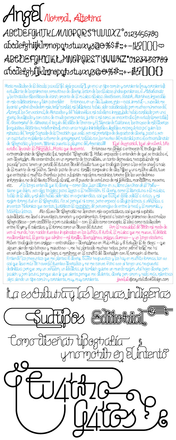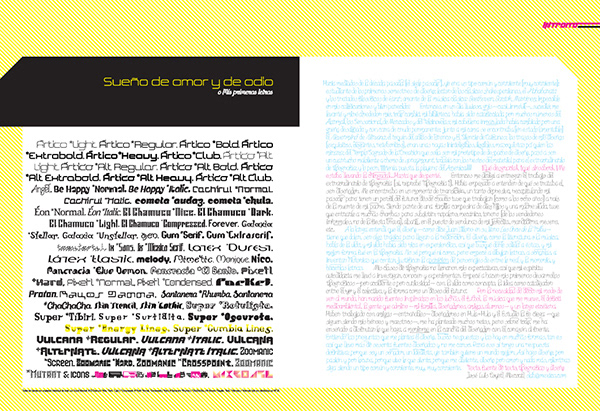
In 2004, I was invited for the mexican design magazine ENEO to be published with a review of my typographic work. They gave me the chance to write my own text and design the spread. So, I just wrote my text and I decide not just to design the pages that they gave me, also the body type of that. So, I just started to develop something intricate, complex, with the purpose to do a very unique body text, and the final result was a text with a lot of different letter from each other, one by one placed specially, just as the old printers of movable type, but in a digital way, with unique ligatures, a very visual words and with unique treatments. It takes a long time but I got something that I'm very proud to show.
At the end of the project, I just separate all the characters (after to finish and deliver the project) and I got a set of type designs enough to fit easily 5 different keymaps of the same font because the wide variety of letters that I did.
The design was too succesful, that the magazine give me the work to do the headlines of each article in that number, in which by the way, was a Typography special. This is a quick review and the full body text that I did of the elements that I designed.