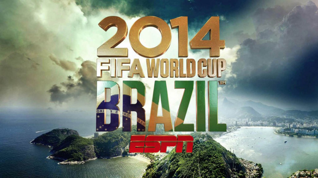
Designing a full graphics package for a big event like the World Cup for ESPN demands a lot of collaborating talented people. One of those parts is designing a logo with all the elements involved in it, like a typographic palette, colors and graphic style. Because the main presence in the broadcast, it takes much attention for getting an unique personality plus the brand of the ESPN network.
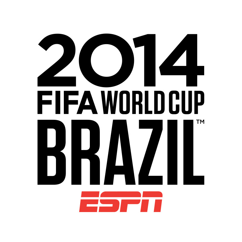
As a specialist on type and font design, I was on charge on the logo research and solution in the 2D stage. After a wide exploration and revisions (including some custom type explorations), the logo was accepted with a simple and tasty type selection and adaptations of Gotham, Tungsten and Blender.
You can see samples of the full project here with amazing work of the Prologue's full team involved. A really wonderful work as usual.
*Designed in Prologue Films.